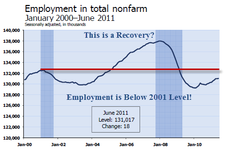
I don't guess it is proper to say I "like" posting up lost decade graphs, but they do illustrate a point: this economy is in depression, still, and when it gets worse it will be a
(wait for it)
double dip.
********
The last link is different now. The Dow Jones index is up about 8% in the last decade- not horrible. The S&P index however . . .

No comments:
Post a Comment
I will review your comments prior to publishing them. Almost all comments are approved and published within a day or two. When you post a comment, Please bear in mind that you are addressing me personally. To be clear: I generally prefer clarity to agreement. Make your point, but be nice about it and don't annoy me, and you will likely see your comments published here.
Comment Moderation Statement