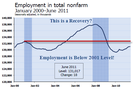
I don't guess it is proper to say I "like" posting up lost decade graphs, but they do illustrate a point: this economy is in depression, still, and when it gets worse it will be a
(wait for it)
double dip.
********
The last link is different now. The Dow Jones index is up about 8% in the last decade- not horrible. The S&P index however . . .


No comments:
Post a Comment